I have liked this show for a while but I've never really appreciated the design they used for the show. Art nouveau was just covered in my design history class a few weeks ago and I can see a bit of that in the font design for the big V. Art nouveau was partly influenced by celtic designs and floral designs both of which are present in the design. This is very representational of not only viking design but art nouveau as well. The function of this design is likely to promote and advertise the show to obtain more potential viewers.
Monday, December 11, 2017
Vikings Logo
I have liked this show for a while but I've never really appreciated the design they used for the show. Art nouveau was just covered in my design history class a few weeks ago and I can see a bit of that in the font design for the big V. Art nouveau was partly influenced by celtic designs and floral designs both of which are present in the design. This is very representational of not only viking design but art nouveau as well. The function of this design is likely to promote and advertise the show to obtain more potential viewers.
Vintage pencils
A few years ago I got a few sets of vintage pencils as a gift for
Christmas and I just love a lot of the very old fashioned fonts and
design styles shown on many of the cases here. There's a little bit of
Victorian influence on some as well as Art Deco for some of the typefaces on a few others. These
are the real deal, they were made back in the day when they still used
lead which is not common to find in drawing pencils anymore, very happy to have these.
Cycling Frog
Creative
and well executed illustrations are something I always stop to look
at. I found the image in Communication Arts Magazine and it looks to me
like the entire piece was done in Adobe Illustrator. Note to self
practice more with Illustrator, I want to be able to draw something like
this sooner or later.
Balraj Chana
http://www.printmag.com/web-design/balraj-chana-ui-designers/
I found Balraj Chana through Print Magazine and spent a good while looking at his designs and really grew to appreciate how much clarity and sensibility of placement his designs have. His use of color to either emphasize or create subtlety is clearly well thought out because some of his designs incorporate a lot of highly saturated colors but he seems to balance them very well and they don't ever become to jarring or confusing. I would say Balraj has clearly got a good handle on color usage and how to apply it where it matters.
This is a design Balraj worked on for an interactive educational web game
Art vs. Design
This to me has a certain Dada feel about it. Its' deliberate obscurity is fascinating and the repositioning of the art itself feels like a very Dadaist thing to do. There's a lot about this that I appreciate because the person who wrote this makes a very good point written in the smaller print and I do really like the way this design is laid out. But I also like art in almost all its various forms (few exceptions may apply) and this seems like a deliberate B***h slap right in the face of art in general. The function of the design seems to voice the designer viewpoint on the art vs. design argument. Me personally I appreciate both design and art. They both have their place and to shun one and only acknowledge the other in my opinion limits ones creative horizon.
Type Design
I'm not sure if I entirely agree with this quote, but as far as typography goes as well as the layout of design I certainly enjoyed what I see here. The function of the quote is likely to promote a certain viewpoint the artist has about design. The design itself compliments this well because it makes the reader follow the sentence almost chaotically around the design until reaching the end. The reading process isn't logical but that's what the designer is likely trying to get across because the sentence layout is designed to look like it doesn't know where it's going and that reflects the very nature of the quote really well.
Friday, December 8, 2017
Wednesday, November 8, 2017
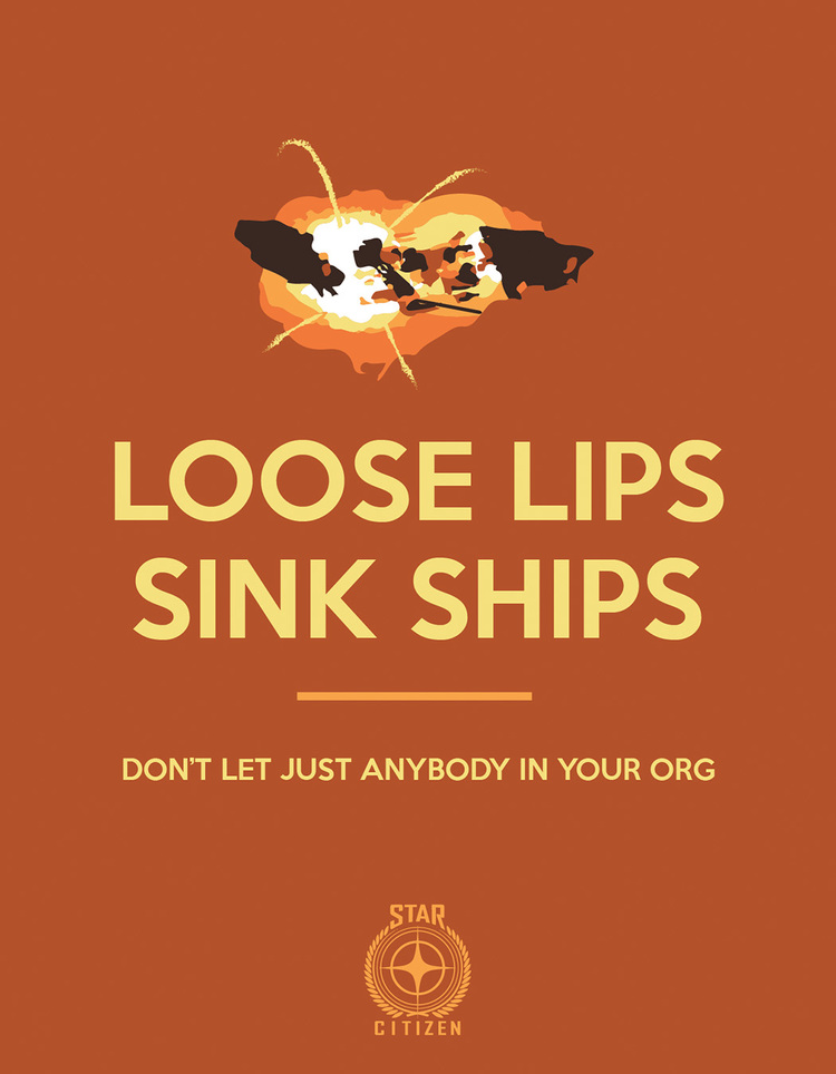
Loose lips sink ships
While searching for space ships to use in homework 12 I found this little bit of design. It was created by a fan for the game Star Citizen and there are several components about it that I appreciate. It has a very early modern feel to the design and in particular it reminds me of the type of design that was common in war propaganda from WWI to WWII. The illustration relies on flat silhouettes to produce the image of a ship exploding. The more I looked at this design the more I began to recognize it as a reproduction of an actual WWII propaganda that had the same tagline. I really thought it was neat because the message that is portrayed about espionage was very relevant during WWII and will also be very relevant in the game Star Citizen, so it was a really nice way of taking an older design and remaking it.


Wednesday, October 11, 2017
Business Cards
As Paul Young has mentioned before it is a great piece of advice for any artist or designer to collect as many business cards as possible, while at Dragon Con I collected a lot. Here are some samples
Kerrygold Pin
I work in food service as part of a part time job, but I also work in graphic design for school. Whenever I can I try to find ways where the two worlds collide. Here is a little merchandising pin from Kerrygold Creamery
Blade Runner
For those who have or have yet to see the new Blade Runner, here is a quick reminder of what the old cover art looks like
Pokemon Cards
Pokemon Also came up in conversation during project 1, a lot of similar design elements that you see in Magic The Gathering you also see on Pokemon Cards
Magic Cards
There was a lot of focus on gaming related business for project 1 and Magic The Gathering was a subject that came up, for greater context on what those are and what they look like there are a few images below. Each card involves several different design elements. There is obviously font usage, symbol and logo usage, illustration and more.
Vintage Pencils
A few years ago I got a few sets of vintage pencils as a gift for Christmas and I just love a lot of the very old fashioned fonts and design styles shown on many of the cases here. There's a little bit of Victorian influence on some as well as Art Deco on a few others. These are the real deal, they were made back in the day when they still used lead which is not common to find in drawing pencils anymore.
Wednesday, September 13, 2017
Giertz Gallery Visit
Earlier I visited the Giertz Gallery at Parkland Community College and found some graphite drawing done by Liza Wynette. This is a sketch of one of her works featured at the gallery.
Wednesday, September 6, 2017
Dragon Con
I attended Dragon Con in Atlanta over Labor Day weekend and it was an absolute blast. This is their current logo for the event.
Subscribe to:
Posts (Atom)


